The Color in Movies
How 'The Adventures of Robin Hood' is a prime example of how to utilize color to create a lasting image

Turner Classic Movies’ ‘31 Days of Oscars’ is one of best times of the year — at least for yours truly. Similar to the sensation of March Madness, where an exciting basketball game is seemingly on all the time, TCM typically plays the greatest of the great. The best of the best.
The other night, while I still suffered from a man cold (the worst ailment ever, am I right?), I plopped on the sofa like a sack of potatoes, turned on the tube, and caught the third act of the swashbuckling, action flick The Adventures of Robin Hood (1938). It’s a movie I’ve seen countless times throughout my life: Robin Hood (Errol Flynn) is an iconic film hero — dashing and principled; Maid Marian (Olivia de Havilland) is an intelligent, beautiful sight to behold; and Prince John (Claude Rains) oozes evil, and enjoys inflicting misery. (Side note: how did Rains never win an Oscar, especially for this movie?)
In a word, it’s fun. And under Michael Curtiz’s excellent direction, The Adventures of Robin Hood has a kinetic energy that never lets go until the credits roll — and even then, you’re probably still humming the heroic leitmotif.
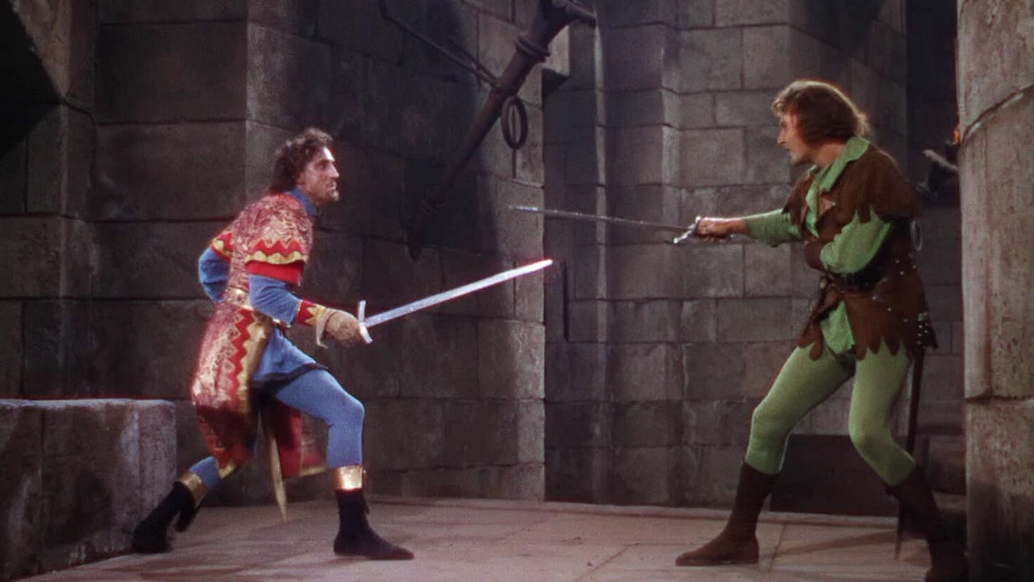
But what struck me in my latest viewing was not the size of the set pieces, nor Flynn and de Havilland’s on-screen chemistry, but simply the look of the movie — particularly the color. In my humble opinion, The Adventures of Robin Hood has one of the best uses of technicolor ever.
Shockingly, the film was Warner Bros.’ first experience with the three-strip Technicolor process, according to Roger Ebert’s retrospective review; and the decision to shoot in color happened late in development, only three months prior to production. For the movie’s scale and expense — costing nearly $2 million — color was a gamble. But with the success of Captain Blood(1935), another Flynn and de Havilland swashbuckling adventure, Warner Bros. took the chance, and it paid off. Robin Hood was a financial hit and critical darling, snagging several Academy Awards for Best Art Direction, Best Film Editing, and Best Original Score. Nominated for Best Picture (or back then, Best Original Production), the film lost to Frank Capra’s You Can’t Take it With You.
Back to the point, the colors blaze off the screen — and that is credit to the art department. The costumes and lighting truly enrich the reds, greens, and purples, allowing them to pop. It’s difficult to describe, but if movies are truly a medium where the images are seared into your memory, The Adventures of Robin Hood passes with flying…well, colors.
This could very well turn into an ‘old man yells at clouds’ piece once again, but the early Technicolor movies — like The Wizard of Oz, Gone with the Wind, even The Four Feathers — all utilize color similarly, with an unnaturally heightened, yet alluring appeal. Other movies pre-New Hollywood were lavishly draped in color like Singin’ in the Rain and, dare I say, even Vertigo (one of the most overrated movies ever, and here’s why).
Today, however, colors don’t feel enriched — or don’t even ‘wink’ at the audience, reassuring you that yes, you’re watching a movie. They feel surface level or computerized to death. And, to borrow a line from Red Letter Media, you may not necessarily notice, but your brain does.
There’s an excellent video about the breakdown of Marvel movies’ color grading that I believe applies to most modern movies (there are exceptions, for instance The Florida Project, The Grand Budapest Hotel or even Once Upon a Time in Hollywood). The reason why movies fail to have colors that ‘pop’ nowadays, I suspect, can be largely attributed to the fact that most are shot on digital. Coincidentally, The Florida Project, The Grand Budapest Hotel, and Once Upon a Time in Hollywood were shot on film.
The way film captures light and color far surpasses digital in a movie’s look; it’s why Raiders of the Lost Ark feels more ‘real’ than the upcoming Indiana Jones and the Dial of Destiny. Maybe it’s an unfair comparison, but my point is that moviemaking requires manipulating the audience to suspend their disbelief. There are many entry points in accomplishing this main task, yet imagery sticks with you long after you’ve seen the movie (though even bad imagery can stick around…).
The Adventures of Robin Hood was a pleasant reminder of how color usage can truly lure the audience into a story and create a lasting, beautiful image. Today, that appears to be more of a lost art in the digital age.
Ranting at clouds over…
*Appendix I: Speaking of Captain Blood — if you enjoy charting movie influences like I do, if you’ve seen Pirates of the Caribbean, I’d recommend having a screening of the first Errol Flynn swashbuckling adventure film. He plays a pirate. They visit several ports in Pirates. There are some huge action set pieces for its time. The music is great. Olivia de Havilland and Basil Rathbone are excellent as well. Funny enough, Michael Curtiz also directed the 1935 film — he borrows a number of shots from Captain Blood, yet they are expertly enhanced.
*Appendix II: Speaking of influential Errol Flynn/Olivia de Havilland/Michael Curtiz movies — did you know the barroom brawl scene from their 1939 western Dodge City inspired the ending of Blazing Saddles? Weird, but true! It’s silly in its own right.


